
With the release of the iPhone X comes the perpetual stress of having to work out what the ratio of visible window vs browser chrome that Safari displays on first landing & load of a web site. This is compounded by the iPhone X being the first “all screen” device from Apple, the new Home indicator area, “notch ears”, & the introduction of safe areas – defined by the system – that will affect layouts in landscape.
So to make my life easier, I’ve pulled together a visual reference for myself for the spaces I should work to if I happen to be designing elements for this specific size.
iPhone X dimensions
Safari on iPhone X has a screen display size of 375 points width and a height of 812 points.
iPhone X is a 3x retina device compared to it’s predecessors in the 2x retina display in the 4.7inch iPhone 6-8. What this means there are three times as many actual pixels than the display screen size of 375x812points to display our content.
The actual number of pixels is 1125 pixels in width and 2436px in height.
iPhone X Safari visible area and browser chrome portrait dimensions
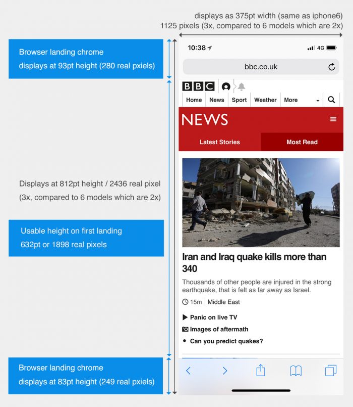

When first landing on a web page in Safari, there is still initial browser chrome to deal with rather than accepting the screen size as the available space.
The available space on first landing is:
width: 375pt / 1125 pixels
height: 632pt / 1896 pixels
iPhone X Safari visible area and browser chrome landscape Dimensions


When first landing on a web page in Safari, there is still initial browser chrome to deal with rather than accepting the screen size as the available space.
The available space on first landing is:
width: 724pt / 2172
height: 325pt / 975 pixels
Landscape Safari introduces safe areas to automatically inset the entirety of content on the left and right hand side in landscape. If you don’t find this aesthetically pleasing this can be controlled using a meta tag, however you will be then responsible as the developer for adding appropriate padding to your content. There is a good write up on the WebKit blog about how to do exactly this.
Whilst weighing up whether you should bother with insetting the content, it should be noted that iPhone users don’t tend to use their devices in landscape all that much.
thanks to @scientiamobile for the detailed breakdown of Web landscape/portrait use by OS & screen size: https://t.co/E1ov5nCKHU pic.twitter.com/7e8PgoSUft
— Luke Wroblewski (@lukew) November 8, 2017
Although in reading these stats it makes it easy to ignore landscape, obviously, follow best practice and ensure your site performs well across all dimensions.